Design
I wasn’t initially in a position where I needed to work on a lot of design, but being in Yearbook definitely gave me the opportunity to delve more into that aspect of media. I was able to broaden my creativity as well as my knowledge of different tools and applications.
Make it Pretty
Staying consistent in your design is so important in creating something people will recognize you by.
In my junior year, we had a system for everything that was posted. Yearbook posts would have a translucent color overlay, broadcast would have a color sidebar, and newspaper would have a gradient bottom bar. This created a system that people got accustomed to. When they saw a post, they knew
which program it was coming from, and where to go if they wanted to see more.
This is the “make it pretty” part of journalism. In today’s world, everyone is always concerned about the aesthetics of something. That’s what design addresses. Creating a theme and following that. Creating graphics that the student body will appreciate.
This is an aspect of journalism that requires a lot of thought that most may not consider. To be original with your design and to make sure it is consistent throughout publications takes time.
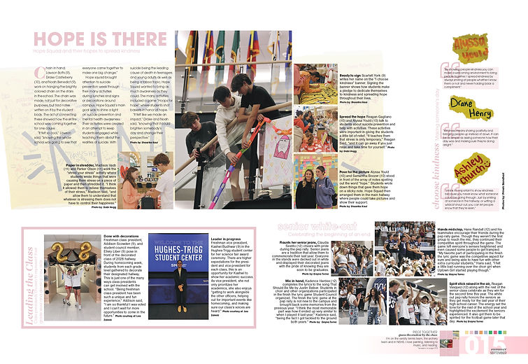
This was one of the first ever spreads I worked on for yearbook. It was definitely a challenge, considering I had only worked with Adobe Premiere Pro and After Effects as compared to other products before this. There was a lot of trial and error in creating this spread and making sure it was visually appealing while still containing all of the elements I wanted there. For example, the banner behind the feature mod was originally not part of the plan. However, in the mod and through the captions, I mention the banner and thought it was important to showcase it somehow. Initially, we had tried to keep it between the quotes and the main mod, but it looked too crowded. I had the idea of putting it behind the mod, and after playing around with that thought, this was the final product.
This spread is one I got to play around with a lot. This was the last page of our portraits, and we were figuring out what to do for it. We decided a day-in-the-life of some students from that grade would be fun. I got to create cut-outs of each of the students I interviewed and form the text around them. There was also a lot of playing around with how big I wanted the people to be and how much I could write about their day. Later, once I had finished the four boxes, the spread was still looking pretty bare in places, so we asked other juniors for a quote about their schedule. Then we placed those in the spots that were lacking, and that made the spread look full.

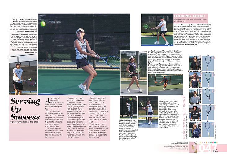
My favorite part of this spread is the “a picture perfect match” mod. It was so much fun getting people to try matching the racket to the player and seeing what they thought was correct. In terms of designing this, there was actually a lot of effort for something that seems so simple. I had taken pictures of the rackets on the court, but the green was washing out the colors of the racket and you couldn’t really see the difference between them. I had already done a few cutouts before this, so I thought it would be perfect to do it again. It would also give me an opportunity to make the rackets a little larger (like how they are protruding out of the blue box a little bit right now— if I had left the original image, I would not have been able to do that). It did, however, take a while to cut out the rackets, especially since photoshop kept trying to get rid of the strings when I was trying to select the racket as an object.
This spread also won an honorable mention at the 2025 TAJE BITS for sports spread

I wasn't the biggest fan of how our season 1 background loop would show up on the camera, so I proposed the design for a new one. I drafted how I wanted it to look on paper and explained to one of our staff members who was very fluent with graphic designing. I wanted our background loop to feature students through the footage we took of them. He was able to bring my design on paper to life, and they still use the background loop today by updating the clips used for each season.
On the bottom half of the paper, I also started to plan out what I wanted our week to look like content-wise. We weren't able to get our social media show running during our first year, but I was hoping we could focus more on it this year since we had gotten the hang of things.
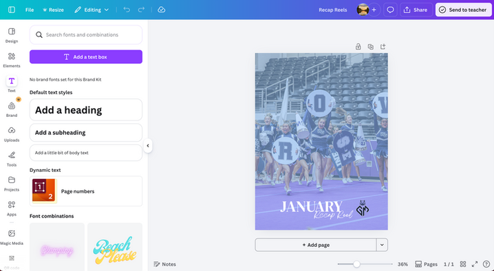
I also designed all of the covers for the recap reels I made each month. Though these were simple covers that I used canva to create, it made sure there was consistency. Simple things like these are what create a brand and let people associate our media with a certain product. All I had to do for each time I wanted to create a new cover was replace the image and make sure the blue overlay was layered on top of the image.

I also took charge of making our new intro for our second season. I wasn't super fluent with after effects and couldn't build an intro from scratch, but had enough knowledge to edit graphics templates to our needs. I started planning out how I wanted to change the template and what I wanted to customize in the intro.
The above is a draft for the final product. There are also easter eggs in the intro that the student body wouldn't know of, but was cool for us. The yearbook theme for that year was "The Big Picture," and they wanted to use easter eggs to tease their theme throughout the year. I thought I would help contribute to that. So many of the random letters that pop up through the intro were actually intentionally picked and they spell out "The Big Picture."
